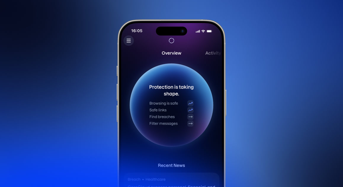
Before setup is finished
Until setup is complete, a card at the top offers to start it: headed "Welcome to Kiren", with a Get started button. Once there is some progress, or the card has been dismissed, it is replaced by a slim reminder with a Continue link and a close button.
While setup is unfinished, tapping the orb resumes it from the furthest point reached, rather than opening the dashboard described below.
Reading the orb
The orb shows three different readings at once. Knowing which is which explains most of what looks surprising about it.
The headline reflects how much has been set up and whether anything is outstanding. It is one of four lines:
- "Let's start building your protection habits." when nothing has been set up yet.
- "Protection is taking shape." when some features are in place.
- "We've found something to address." when something needs attention: a data breach, or a feature such as browsing or messaging crossing into risky territory, meaning too many risky sites, messages, or scams recently.
- "All good out there." when everything is set up and nothing is outstanding.
The feature list below the headline shows up to four features (three when a breach has been found), each with a trend arrow. Which features appear changes over time based on setup state and priority; a feature missing from the list is not a sign anything is wrong with it. Wording changes with each feature's state: browsing reads "Protect browsing" before setup, "Browsing is safe" when healthy, and "Risky sites found" when not. Some features are Android-only.
The arrow next to each feature:

Gray and flat: the feature has not been set up.

Blue and flat: set up, with no activity recorded in the period.

Blue and pointing up: set up, and activity has been healthy.

Red and pointing up: set up, and enough recent activity was risky to be worth a look.
The orb's color follows something narrower: the balance of safe and risky events over the last 24 hours.
- With no events in that window, the orb is a bare ring with no glow. This is normal on a quiet day and does not mean protection is off.
- Safe activity fills the orb with blue; more safe activity means more blue.
- Risky activity adds red in proportion; a single risky event among many safe ones shows as a thin sliver rather than a solid block.
When the headline and orb disagree
This is expected, and the most common source of confusion on this screen. The headline switches to "We've found something to address." the moment any single feature needs attention, such as a new data breach, no matter how small that issue is next to everything else being tracked. The orb works differently: its color reflects the proportion of risky to safe activity across every feature combined. A single new breach can be a small slice of that combined total. The orb can still look mostly blue, with only a thin red sliver, while the headline has already switched to something needing attention. Both readings are correct: one flags that something needs handling, the other shows how large a part of the whole picture it currently is.
The Overview dashboard
Tapping the orb opens the "Overview dashboard", a fuller breakdown covering the last 30 days. A card at the top restates the overall position, adding an action button when something needs attention, such as Check breach for a personal data breach. Below it, cards for the individual features are grouped into one section for activity and the device, and another for personal data. Each card opens its feature or setup, and each section has a button to the matching main screen.
Tapping only works near the top of the screen before scrolling down. After scrolling, the orb fades out and stops responding to taps.
Recent News
Below the orb is a feed headed "Recent News". It carries two kinds of article:
- Breach articles report data breaches at companies and services.
- Security insight articles are general security guidance.
These are general news. A breach article here does not mean the user's own details were exposed. Personal findings are reported separately, on the You screen and by email. See Monitoring personal data.
Each card shows its type, headline, and how long ago it was published; breach cards also carry category tags. Five articles show at first, with Show more revealing the rest. When both article types are present, filter chips (All, Public Breaches, Security Insights) narrow the list. A security insight opens expandable with Read more / Read less; a breach article shows a short description and, where relevant, a Go to company website button.
Acting on a breach in the news
Reading about a breach at a service in use is a good moment to check whether anything personal has been exposed. Breach Check looks up a single email address in a few seconds and needs no setup. Adding a detail to be watched covers it going forward and reports anything found later. See Breach Check and Monitoring personal data.